What We Make of This World

What We Make of This World, a two-person show by Melissa Shaak and Sylvia Vander Sluis, was exhibited at Fountain Street Gallery in April 2023. This blog post contains half of a conversation – Melissa’s answers to Sylvia’s questions – that was published in full on Fountain Street’s website.

Q: What were some of your inspirations for “What We Make of This World”?

A: The one that comes first to mind, that I gravitated to early on in this work, is a red spiral stake. It’s actually a tomato stake, and in the garden store I purchased five of them and stuck them in my tiny back yard, making an informal garden sculpture. Several years on, I decided to try moving and dancing with them, and that took on a life of its own. The spiral is such a powerful shape, found pretty much everywhere in the universe. For me, the spiral became both physically and symbolically important—as a way of extending my reach, the reach of the “seeker” in my videos.  

Viewers can see the spiral stake in the gallery, along with the other objects I used in the show’s videos. It was fun to think about this sculptural element as tangible evidence of both my and my character’s exertions. I also like that it connects to your assemblages. I did a preliminary sketch for placing my objects in the gallery, but I’m sure it will evolve in interesting and unexpected ways during the installation!

Sketch of “Evidence” assemblage

Q: I’ve been struck by the way your work has leapt from the two-dimensional surface to become three-dimensional, and then video based in a relatively short space of time. What can you tell me about this progression?

A: The progression has been very surprising. A few years back, when I decided to make art full time, I remember thinking that I wanted to see what was “in me” artistically. Who knew? It has evolved from painting to transforming paintings into sculpture and video, which in turn led me to the intersection of video and performance art. There were some early signs though, as when Bob Siegelman, in teaching a drawing course at SMFA, recognized and encouraged my inclination to include “performative elements” when sharing my work. Or when I “married my muse” in a mock-ceremony during Creativity Lab at the New Art Center.

Improvisation at Creativity Lab, 2018

When I joined Fountain Street, I had the pleasure of getting to know two core member artists whose work in video drew me in – Allison Maria Rodriguez and Joseph Fontinha. They have generously encouraged my own experiments in video, and, while their styles are vastly different, each continues to be an important touchstone for me.

I have also been drawn to the pioneering spirit of Nam June Paik, who has been described as the “ground zero” of video art. He was wildly experimental, and often used his own persona to point to the larger theme of the artist’s place in the world. I couldn’t NOT pay tribute to him in this show, which I do in “Homage.”

Image of Nam June Paik which inspired “Homage”

While it has been a BIG learning curve, on most days I find video to be a fun and interesting challenge. I’m still working at a very basic level though, staying close to what I can do on my own as opposed to involving others or creating digital special effects. That feels truer and closer to my interests and what compels me to do video—which is to explore and embody, in my own quirky way, the creative process. To take the creative sparks and offer them up in the hope of encouraging others to do the same. It’s a deeply meaningful pursuit for me.

Q: Can you say more about the importance of supporting others? It reminds me of what you said in your artist statement about your “...deep desire to connect interior and exterior worlds.”

A: My decades working in higher education trained me to look for ways I could support individual students as well as for opportunities to develop programs and policies that helped create more access for all. I hadn’t thought about the connection before, but the word “access,” which is used widely in describing educational opportunities, also resonates for me in terms of the creative process. I came to artmaking mid-life, with no background, just following one of those sparks. And so, it was really important for me to find easy ways “in” (a big shout out in this regard for gel plate monotypes). And probably even more important to find people who would encourage me to tap into the deep well of creativity (another big shout out, this time to Adria Arch). Now it’s about passing those gifts along in whatever ways I can.

Q: What has this experience (working with Katie Semro to create an audio scape) been like for you so far? Have you ever worked with an audio creator before?

A: It has been a tremendously fun and new experience. I shipped to Katie over 20 minutes of fragmented voice recordings, and she managed to create an artful, poetic, rhythmic 2-minute piece that captures the essence of all I was trying to say. I was amazed. I think our respective audio scapes will add interest and make for a wonderful, shared element in the show. Can’t wait to see and hear.

Q+A with Beacon Gallery as part of "Jamaal Eversley's Real F.R.I.E.N.D.S"

Q. What was your path to becoming an artist? How did you develop your artistic style, and how has it evolved over time?

A. My artmaking journey began a little over 10 years ago, by accident, or seemingly by accident. I love to tell the story—I was having dinner with a friend who described using paint colors in her work with hospice patients. She would take paints, paper and a brush, and work with people one-on-one. She would start by asking, “What color wants to go first?” Then, “What color wants to go next?” “Do the colors want to touch, mix, or stay separate?” She found that, even in the very last days and weeks of life, people often had clear preferences for colors—they resonated with something deep, true and profound. After that dinner conversation I went home and felt a powerful longing, hoping against hope that someone, somehow, would know to do that for me when I was dying. Waking up the next morning, I realized, wow, maybe I didn’t have to wait until I was dying! I called my friend, we got together, and she started me on my painting journey. I will be forever grateful for that.

Since then, I have worked in acrylics, on paper, in an abstract, intuitive, trial-and-error process. I have taken numerous courses with Adria Arch, starting with making monotypes on a gel plate, a highly accessible and relatively speedy process which encourages endless experimentation and discovery. My next step was a course at Tufts SMFA with Robert Siegelman, which I then repeated a number of times. While classified as a drawing course, in Bob’s framework anything can count as drawing. He encouraged my inclinations to transform what had started as 2D pieces into 3D, and to add performative elements. I think of this as a process of the imagination seeking and finding form, a concept explored by poet Wallace Stevens.

Q. What inspires your work, and how do you land on your subject matter? Do you have any particular routines to motivate your creativity (i.e. listening to music while you work)?

A. I think for me the subject matter and creative inspirations arise when I’m in there, doing the work. I’m reminded of Corita Kent’s rule -- “The only rule is work. If you work, it will lead to something.”

Q. How did you first connect with Jamaal, and how have you collaborated since? What work(s) are you thinking to contribute to Beacon's show, and how do they incorporate themes of friendship?

A. I got to know Jamaal when he was a student and I was an administrator at Babson College. At the time he was already involved with the arts – especially visual arts and theatre – but it was before I knew that I had any interest in artmaking. We reconnected a couple of years ago at the reception for his two-person art exhibition at the Hollister Gallery at Babson – and voilà – we started talking about art and have been talking about it ever since. Jamaal is a treasured friend—always interested, supportive and deeply thoughtful—and a collaborator par excellence. Our joint work “Seer ::::: Pentaptych” is actually a four-person collaborative creation. It involves painting, sculpture and poetry – fantastical elements all – but the mythical pink creature at the very heart of the piece is all Jamaal. It’s a great metaphor for how his boldness draws us, his circle of friends, into his large and hopeful vision.  

Q. What projects are you working on right now, and what would you like to accomplish in the near (or distant) future?

A. This year I started experimenting in video and stop motion animation. This surprising turn was inspired by my paintings of seven oddly archetypal figures, who “decided” they wanted to come off the wall. I worked with a signmaker to turn them into cutout figures, and then videoed them moving in time and space. Working in time-based media has opened up a whole new world, and I can’t wait to see where it goes!

Q. I'd love to include any art, book, movie, recipe, media, etc. recommendations, or just anything you've been particularly enjoying recently.

A. In contemplating your question, I can’t stop thinking about “Exquisite Corps” (Mitchell Rose, 2016), a video short that circulated widely on social media early in the pandemic. This inspiring piece involves forty-two choreographers, each of whom created and danced a short segment. The genius of it is in the transitions – each dancer starts in the position that the prior dancer ended with. The title is a play on “exquisite corpse,” a collective drawing or writing method. It reflects our deep desire to connect, to be part of something larger than ourselves. The beauty is in the join – where and how each artist hands off their creation to the next, trusting that it will be honored as a precious gift—very much like in Real F.R.I.E.N.D.S.

Too Trite? What's in a Name

Titles swimming, titles spawning. A thousand joys, a thousand titles. Six titles in search of a painting. This is what my mind does, and why I needed a “titles” project. I have the good fortune to be one of twenty-eight core members of Fountain Street Gallery. The work of these dear colleagues served as the basis for this investigation of titling styles. You can go to the same source—the artists’ pages on Fountain Street’s website—and see if you agree with my award winners. If not, please nominate others, or, better yet, invent a few new categories of your own.

I won’t be so bold as to say that titling styles are windows to the soul, even if they are. But titles speak to, and about, what the artist sees and hopes to convey. In our Fountain Street web-presence midst there are titles that name specific locales (here I list a few examples in each category, in this case Parramatta Road, Lechmere Viaduct, Lundy Canyon Aspens) and others that allude to spatial relationships (Between, Entanglements, Universe Within). Some of our titles point to the form of the work (Four by Four, Nine-Patch Collage Painting) and others the color and light (Cadmium Yellow, Luminoso). Movement and rhythm make a nice showing (Allegro con brio, Oscillate, Slow Dance, Ripple Idly, Rhapsody). We have titles of familiar objects (Xbox Controller), familiar attitudes (Noncommittal) and less familiar, more technical terms (Martindale). Quite a few of our titles describe things in decline (Broken Television, Crumbling, Collapse of the Environment).

I often think of titles as short poems, which can be uplifting (It’s How We Float), epic (War in Heaven), or a way of paying homage (Waiting for Isaac Levitan After School). While I haven’t seen titling described as a form of ekphrasis (1), I believe it is. Titling uses a different creative process, in this case writing, to respond to, frame, or amplify a visual work. It’s a great pleasure for me to look at a piece and then read its title; sometimes the name reinforces what I’ve already taken in visually, while other times it adds a different, even surprising, dimension. In any event, titles are handles, and, as such, an important means by which we represent our work. It has been great fun to get to know more about my fellow Fountain Street core members in this way.

And now, without further ado, here are the prize winners!

Best alliteration: Man in Balaclava Eating Baccala and Baklava by Mia Cross

Most paradoxical: In the Presence of Absence by Allison Maria Rodriguez

Best exhortation: (Three-way tie!) Thrive Where You’re Planted by Jim Banks, Let the River Take You by Joel Moskowitz, and Light My Way Home by Marcia Wise

Best pattern: Sara Fine-Wilson, whose titles are all single-word descriptors, presented in reverse alphabetical order

Biggest stylistic range: Joseph Fontinha for titles ranging from the succinct Rain to the longest in the field, Kerosene Cans in Concrete Block Cube, Tree Stump, and Yesterday’s Fire

Best play on words: (d)Over Strait by Tatiana Flis

Most vivid: Sex Broom, Long Pink by Daniel Zeese

Most timely: Life Preserver (Because We Need One) by yours truly (2)

My personal favorite: Rock Dreaming of Rocks by Kate Carr

CONGRATULATIONS TO ALL!

(1) Ekphrasis often refers simply to a poem created in response to a piece of visual art. More broadly, it can describe any “intermedial creative processes,” as in a painting inspired by a piece of music, or a piece of music inspired by a poem. Krauth & Bowman, Ekphrasis and the Writing Process, The International Journal for the Practice and Theory of Creative Writing, 2018.

(2) Can you award a prize to yourself?

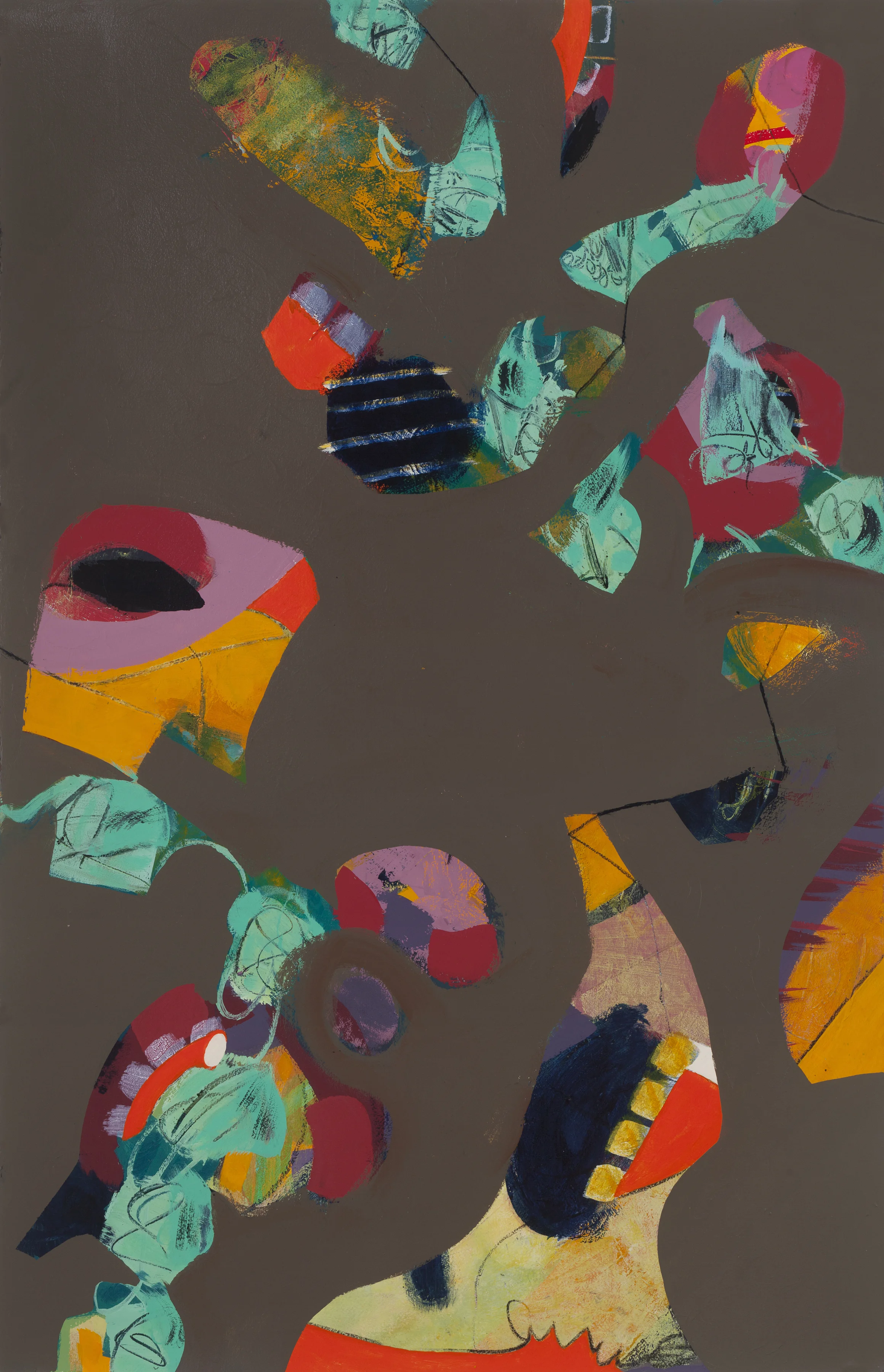
Consider the rise and fall of the deep taupe

At first glance the flat color in Archipelago appears monolithic, but as the eye moves, the flora and fauna of the “islands” take shape. Flashes of warm, saturated color—yellow, orange, pink, red—are joined by scraggly, blue-green patches. What is being revealed? Plumage or foliage? Desert or jungle? Several small lines appear as bridges between the shapes. But they are tenuous ones, hardly assuring safe passage. Between the lines lies the question, a disturbing one at this moment in time, of whether there is any prospect of bridging the distance. In making extensive use of the single, flat color, I leave the question visually unresolved. In this work I am continuing my exploration of how the act of concealing, by means of overpainting, actually reveals and brings focus to the sprawl of life in the layers underneath.

Archipelago, acrylic and charcoal on paper, 40 x 26 inches

Archipelago, acrylic and charcoal on paper, 40 x 26 inches

What would Wim Wenders think?

Last spring, I had the good fortune to hear a lecture by celebrated movie director Wim Wenders. Wenders described his filmmaking efforts as, in my paraphrasing, fighting the traditional dominance of the storyline. Why? To allow for the unexpected. To let other aspects emerge, which, he asserted, they would if given the space. To be able to receive artistic gifts as they unfolded—poetry in motion, he called it. I tucked these ideas away.

Did my intrigue with Wenders’ contrasting the storyline with poetics influence my artmaking? Or did it simply give me a useful framework, post-facto, to interpret what I had created? I’ve been puzzling about this question and can’t say for sure. But here is how things came together over the summer. I was experimenting with the color gray. I applied it in big, broad swaths overtop other paint. I found, as the gray was covering certain areas, that it also was illuminating and bringing focus to neighboring areas. What conceals also reveals.

I further discovered that I could enhance the effect by outlining the swaths in the color teal. The inspiration to try teal came from seeing the painting Grey Cells by John Howell White at PAAM (Provincetown Art Association and Museum). I continued my experimentation with these elements, working over formerly discarded paintings and pleased that I had found use for them in this new series. When I finally assembled the grouping and stepped back for a long look, Wenders immediately came to mind. I saw the big, almost primitive storyline represented by the gray outlined in teal. I also saw “gifts” emerging in adjacent areas—colors, texture, variety. I found the contrast compelling.    

For me, it’s the contrast that gives the pieces their visual interest as well as their meaning. The contrast of the small-bore versus big, epic stories. The contrast of complex “villages” living vibrantly aside the myth. When I look at the paintings, I see above all this interplay. I believe it reflects a deeply-felt quest for balance, particular to these challenging times. What Wenders seeks to achieve in his films applies urgently to our own stories—how to allow more nuance to unfold amidst the arc of the storyline (aka “through line,” the title of the series), how to emerge from under the myth.

What color wants to go first?

I stepped into artmaking in mid-life, seemingly by accident. A dear friend happened to mention an experiment she had tried in her work with hospice patients, asking them to respond with their preferences for paint colors and combinations. I left that conversation with a deep longing, wondering if perchance some kind soul might do that for me when I was dying. The next morning, I awoke with a happy realization—maybe I didn’t have to wait until I was dying. I called my friend. When I arrived at her house, she had containers of tempera paint lined up on the table and a big roll of white paper spread out on the floor. The prompt that she used to start me off was, “What color wants to go first?” And thus it began.

That was a decade ago. What a joyful journey it has been. In the early years I took courses with Adria Arch, who offered a rich variety of methods to tap what she calls “The Infinite Well” of creativity. The most accessible for me was making monotypes with a gel plate—applying acrylic paint with a brayer, hand-pressing paper into the plate, pulling it back, scraping through layers, then repeating, again and again. Each new image was a revelation. This way of working, “indirectly” (i.e., applying paint to the plate rather than onto paper or canvas) and with a brayer (rather than brush), gave me an entrée to an intuitive, productive path. It allowed me to clear the hurdle of my fixed image of artist with paintbrush, palette, oils, canvas, smock and, oh yes, beret.     

Along the way I shifted to painting directly on paper. I wanted to create images larger than I could produce with a gel plate. While making this big change, I retained many aspects of my monotype process. I enlisted my printmaking tools—the brayer to apply the paint and a palette knife to scrape away. I used the same kind of paint, fluid acrylics. I continued building up layers in an unplanned and improvisational way. Gradually, other shifts occurred as well. I took up brushes and have used them with growing frequency. I took delight in paintings that started to appear surreal or, better yet, whimsical. I took courses at Tufts’ Museum School with Robert Siegelman, who generously encouraged my impulses to add performative elements to my 2D work. Who knows what else will emerge? I can’t wait to see! 

I mentioned that it has been a joyful journey. Even with the ups and downs inherent in artmaking, I count my lucky stars every day. There have been many wonders along the path, but three stand out as most memorable: first, the surprising moment when I realized that my attic could make a very serviceable art studio; second, when I “married the muse” in a performance piece at the New Art Center’s Creativity Lab; and, finally, when I was invited to join Fountain Street Gallery. I’m thrilled beyond words to be part of such a dedicated and richly-talented community.